Photo by: Jin Lee
Today marks a day forever embedded in our memories. It’s a day we wish we could forget; a day we wish never happened. Nearly 3,000 individuals lost their lives on September 11, 2001, but to the families there may be only one name on that list that, when called out during today’s memorial, causes their deepest 13-year wound to ache anew.
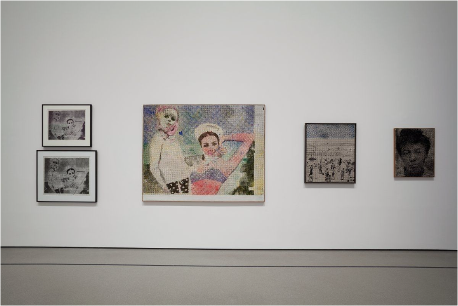
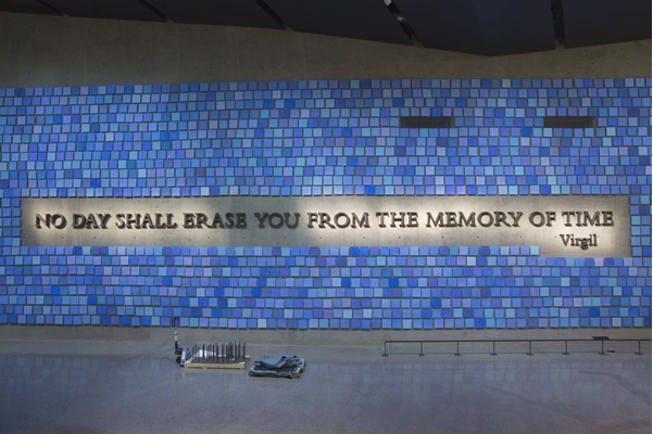
Spencer Finch, the artist commissioned for the National September 11 Memorial Museum, was charged with the task of creating a visual work of art that commemorates the tragic event as a singular whole, yet does not dilute the individuality of each life lost. His final product, now on view inside the museum at Ground Zero, is an eloquent installation that captures a more abstract memory of September 11, 2001: the clear blue early September sky.
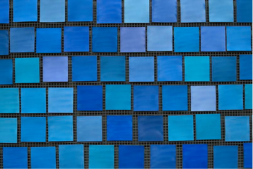
Photo by: Ofer Wolberger
But memory is a funny thing and while everyone who was in New York City that morning can recall that the sky happened to be a perfectly crisp cloudless blue, the exact shade differs from person to person. Or, maybe it’s like trying to remember a dream when the harder you try the quicker it fades. Finch was one of the New Yorkers here that day, so this project became somewhat of a personal endeavor. Trying to Remember the Color of the Sky consists of 2,983 square sheets of watercolor paper- one for every person who died that day and in the 1993 bombing – hand painted in varying shades of blue. In a New York Times article, the artist tells of a construction worker who inquired about the installation and, upon explanation, walked right up to one of the squares and said, “This is the color. This is what the sky looked like that day.” He was one of the survivors. Responses like this make Finch’s artwork successful. Trying to Remember the Color of the Sky connects everyone to a moment that changed all of our lives, a day when everyone looked up at the sky. Each piece of paper represents an individual experience of a day imprinted in our collective memory.
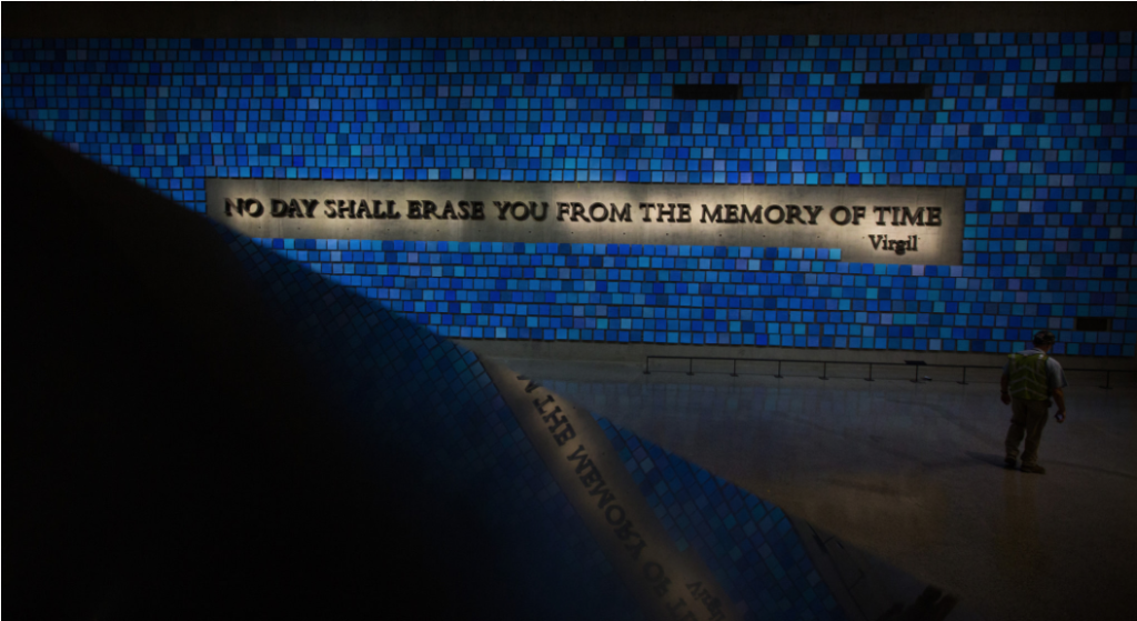
Photo by: Damon Winter/The New York Times
Spencer Finch is represented by James Cohan Gallery. His drawings and sculptures explore color as it pertains to memory, history, and experience, perfectly fitting for an installation such as Trying to Remember the Color of the Sky, 2014. He created a similar work in 1994 called Trying to Remember the Color of Jackie Kennedy’s Pillbox Hat, that also uses an anecdotal yet unforgettable element of a tragic and pivotal moment to signify our collective memory. Not all of his work is based on tragedy, though, and Finch has exhibited his colorful works nationally and internationally that are inspired by a range of sources, from medieval Books of Hours to Henry David Thoreau to Claude Monet. Visit the artist’s site to see more: here. Also on view in NYC: Spencer Finch at the Morgan Library, through January 11, 2015.
To the families who on this day every year go back to the sites where your child, parent, sibling, or spouse died tragically: we all grieve with you. And while we cannot be with you to comfort you on those birthdays, graduations, weddings, and anniversaries when you feel the saddest, we will never forget.